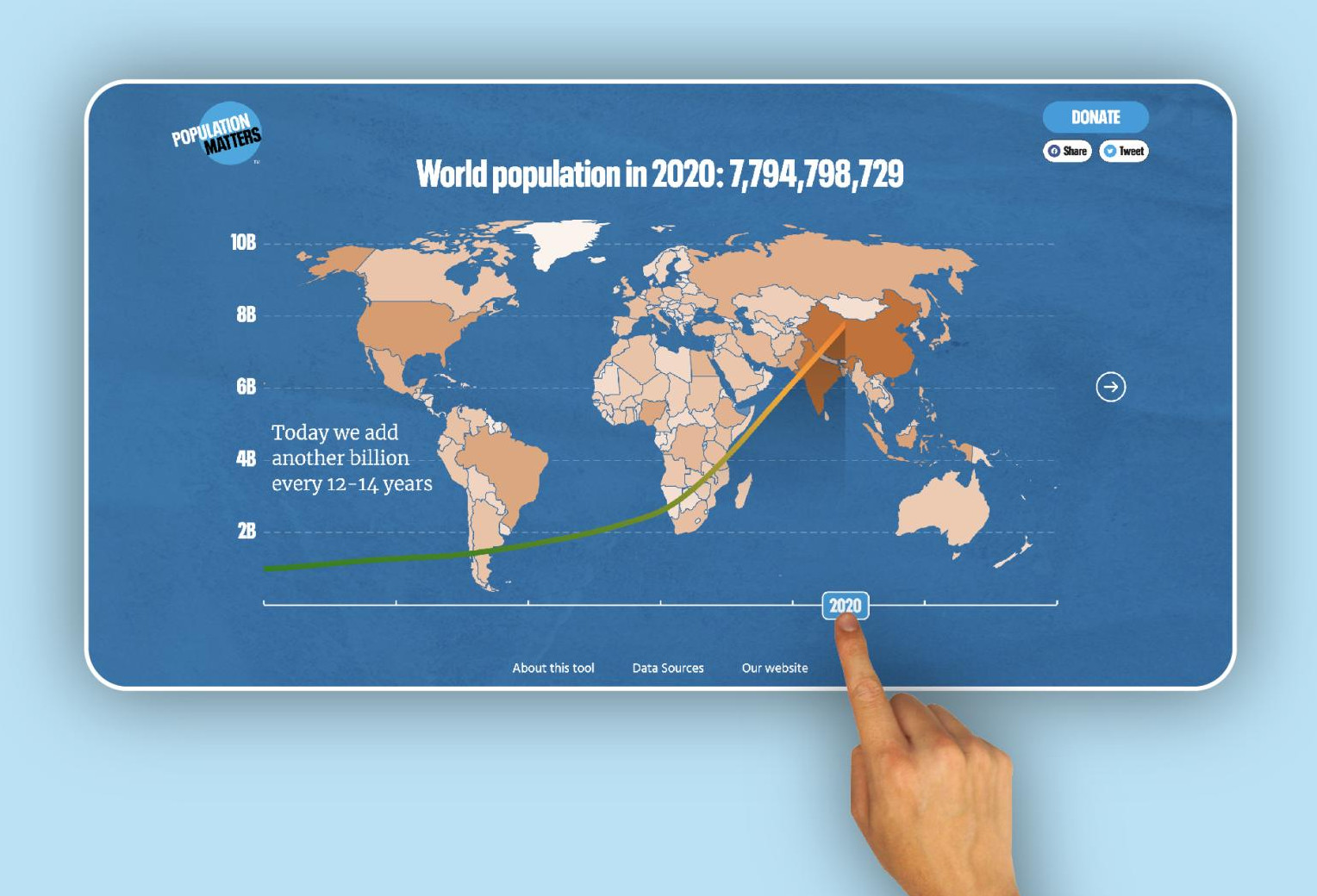
We designed and developed interactive visualisations for Population Matters, to tell the story of adverse effects of overpopulation on the planet.

When a long-standing client of ours, Population Matters, asked us to help them increase their engagement with younger audiences, we were excited to get involved. They wanted us to design and develop an interactive tool that displayed their data in a fun and engaging way that would appeal to the younger demographic.
Discovery
To start off the project we carried out some discovery work to help clarify the goals and scope of the project. This was a three fold research process exploring
- how the tool would fit into their wider organisational objectives
- identifying what their audience needs
- write a new problem statement
This process helped us focus on building a product that is viable for their organisation, desirable to their users, and feasible with the appropriate technology.
Designing and prototyping
With the research under our belts, we went about storyboarding the user journey and visualising their data on human population, climate change and biodiversity loss. Storyboards are a great way to get everyone on the same page. They help us to bring the collective vision for the project to life. They also make it easy for the client and developers to feedback on the design early on.
Simultaneously we created a mood board to convey the visual style, colours, approved images, patterns, fonts, etc.
After multiple iterations of the storyboard we put together a high-fidelity prototype applying a custom design system. The prototype helped gather feedback and initiate discussions about how the user will experience our tool.
Some challenges
When we moved on to building the final product, turning the prototype into interactive visualisations in the browser, we faced some challenges. One particular difficulty in this project was finding reliable data sets that we could use to tell the story and we ended up having to rethink a couple of slides where we could not find appropriate data. Similarly, some interactions that we thought would work well on the storyboard, didn’t quite work when we brought them to life.
Team work makes the dream work
Solving these problems was a team effort. We arranged multiple reviews and feedback sessions with Alistair and Olivia at Population Matters to get feedback and experiment with alternative approaches.
It was a long journey from the first discovery sessions, through multiple iterations until the Explorer was finally ready to go public on Earth Day (22 April’22).
Go to the Population Explorer to check out population growth around the world, their impact on biodiversity, climate change, and natural resources, as well as the actions we must take to build a better future. We are excited to have you check it out and look forward to hearing your thoughts!